Heikki sent me a prompt: "I don't understand why the finance ministry shows the deficit against GDP instead of actual tax revenue." Here's what we found out.
93%
of Estonia's projected 2030 tax revenue would be eaten by paying off the national debt in full. The finance ministry's own headline number — 39% of GDP — is the same debt, just divided by something else.
Same debt, two denominators
GDP is the entire Estonian economy's annual output — everything produced and sold here in a year, added up. Only a fraction of that reaches the treasury, through taxes. When someone says "my loan is 0.01% of Estonia's GDP," it sounds reassuring — but it's the same sentence as "my loan is 0.01% of the combined income of Mustamäe," Tallinn's biggest district. A nice statistic. It changes neither your paycheck nor the state's bank balance.
The government repays its debt from tax revenue, not from GDP. It can't tax the entire economy, only the slice that actually arrives as tax. So if you want to know how heavy the debt really is, divide by revenue, not by GDP.
Estonia's two denominators for 2030:
- Debt / GDP: 39%
- Debt / revenue: 93%
Both are correct calculations. They just answer different questions. The first asks "how big is the debt next to our entire shared economy." The second asks "how big is the debt next to the money the government actually has in hand." The second is the question a bank would ask you before approving a loan.
Why the government prefers 39
Both numbers are published, so nobody's lying. But when a press release has room for only one ratio, it's almost always Debt/GDP — because 39 sounds calmer than 93. It's the same trick as a bank ad: you see the monthly payment, not the annual percentage rate.
Growing everywhere, just at different speeds
Level is one story. Speed is another. I built a chart of six countries' — Estonia, Latvia, Lithuania, Finland, Greece, USA — annual debt growth: not how big the debt is, but how much gets added each year, in euros.
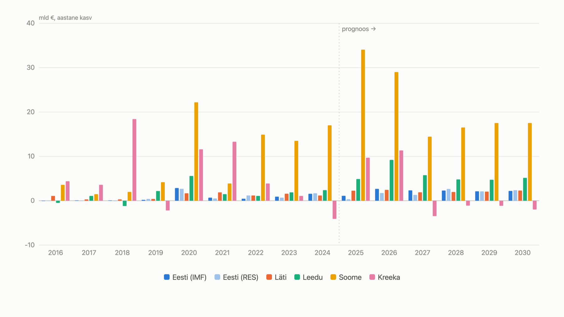
Estonia has two bars on this chart, because it has two sources. "IMF" is the International Monetary Fund's international estimate. "RES" is the finance ministry's own official forecast from its budget strategy. They diverge slightly — by 2030, IMF €2.2bn, RES €2.4bn a year — but the order of magnitude matches. The US is hidden by default: its annual growth runs into the trillions and would flatten every other line on the chart. Switch it on from the legend in the full version.
Finland's debt grows tens of times faster than Estonia's in absolute euros. Yet it's Estonia whose ratio (56% → 93%) climbs faster than any other Baltic state. A small country with small euro sums can still be the one whose burden is growing fastest. Same lesson again: a raw number tells you nothing until you know what it's measured against.
What to do with this
Next time you hear a debt percentage, ask immediately: percentage of what? If the answer is "GDP," ask for the revenue ratio too. The two numbers together give a more honest picture than either alone — one shows the burden against the economy, the other against the treasury.
Want to compare ratios and countries yourself? Behind this chart is a full interactive version with six countries, four ratios and two data tables: see the interactive chart.